
Originally published on Medium, December 2015.
Why Great UIs Run on Grey: Hierarchy, Whitespace and Contrast
The cleanest interfaces on your phone are quietly doing the same thing: they use grey to keep complexity out of the way.
Look through the best-known apps on your phone or in your browser and you'll find the same technique holding them together: grey. As a UI designer, I find it enormously useful.

Seven reasons, then the apps that prove it.
Why grey?
We are bombarded with content, so most brands have become hyper-focused on "clean design." Clean design usually means solid colors and generous breathing room between elements. Mostly it means white space.
The hard part is getting that white space while still organizing layers of information and interaction. Grey is how. It lets a designer lower the prominence of inactive content, emphasize what is important or active, and keep the interface clean.
Grey is how.
Seven reasons grey works
- It's easy on the eyes. Light grey is gentler than pure white, and it makes content shown in white stand out.
- It matches everything. Black, brown, blue, red, orange and green all clash with something. Every color looks good next to grey.
- It gives buttons and CTAs more contrast. If you hold back on color while building layout and hierarchy, you can use the brightest color you can think of for the call to action. The result is a clean layout with a clear focal point.
- It lets you stack white space on white space. Grey nearly reads as white, so you can divide white sections without complicating the design or being noticed.
- It supports many levels of hierarchy. There isn't just one grey. Pure grey hardly exists in nature, so add a touch of tint to your greys.
- It keeps content on the cleanest surface. Supporting structure sits in grey, and the content sits on white.
- It draws attention to content. The brightest area of the page gives content the emphasis it deserves. Content is the truth.
Grey lets us design so that secondary elements and structural guides stay out of conscious attention, which is what good design is always aiming for.
Pure grey hardly exists in nature, so add a touch of tint to your greys.
Grey in the apps you already use
Google Inbox
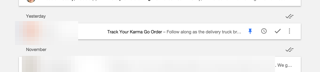
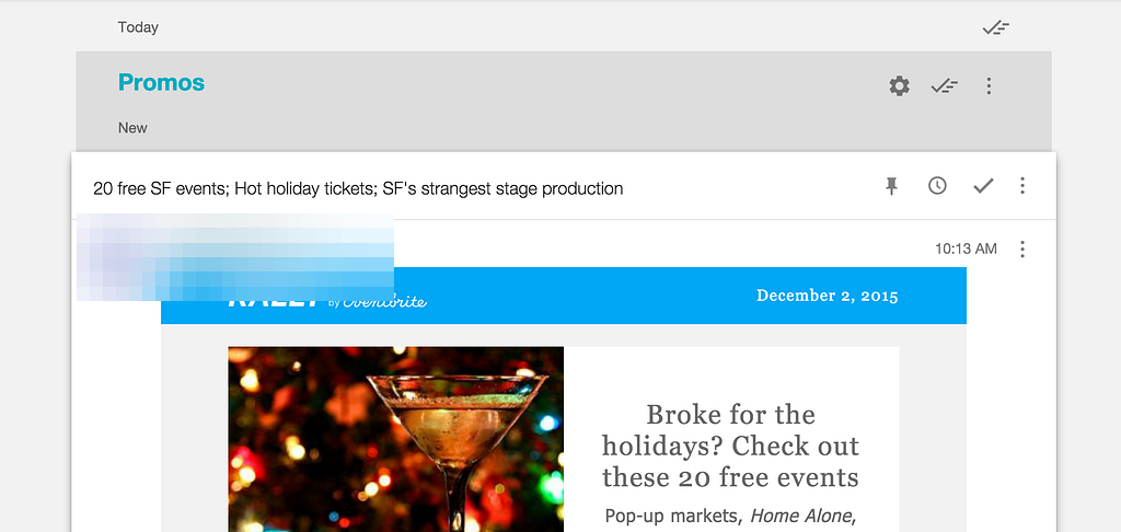
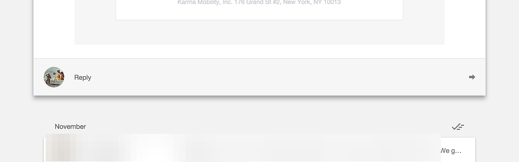
Google Inbox manages hierarchy with several densities of grey:
- Primary content stays on white.
- A light grey background holds the white message previews, and that would feel very different with a white background and grey previews.
- Section headers get a second degree of grey.
- Secondary actions such as reply sit in light grey areas, in the traditional spot at the bottom of the message, so people find what they need.
- Closing a message or a thread uses the check icon, placed in whichever grey level matches its hierarchy.
More examples
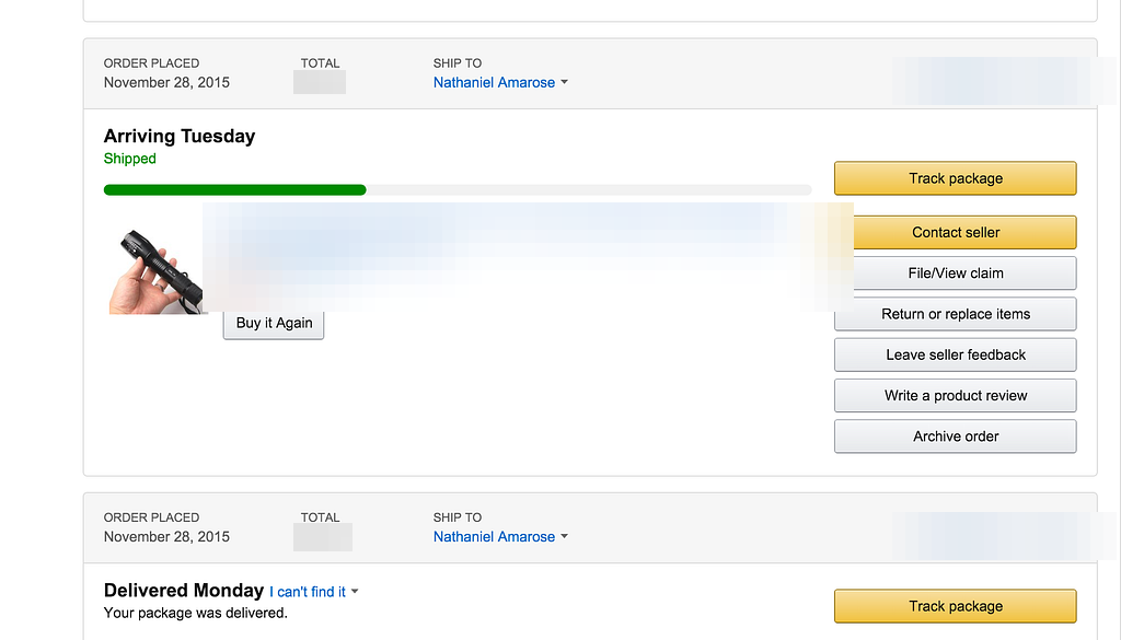
Amazon uses grey headers on its order tracking page to create space between elements and organize information.
Google's iOS products carry the pattern almost everywhere, because it's central to Material Design.
Twitter places white cards on a light grey landscape. On mobile the cards are pressed together, so the grey is easy to miss. On desktop the cards spread out and the grey that supports them shows.
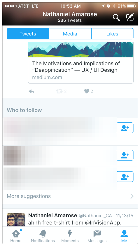
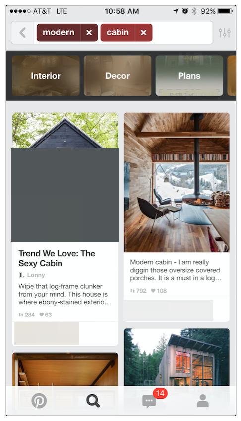
Facebook and Pinterest
Facebook and Pinterest news feeds use the same structure. In many card layouts, grey fills the left and right padding that would otherwise be white space on a text page.
Apple News
Apple News is the near-exception. It's hyper-white, with almost no grey. Even so, its title and navigation bars are about as close to white as you can get without typing six F's in a row in a CSS file.
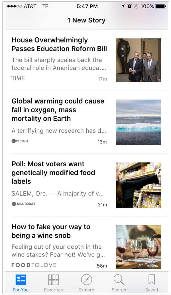
Without typing six F's in a row in a CSS file.
If you don't want to lose the clean feeling of all that white, grey is the next best thing.
Today I'd... (present-day commentary, not part of the 2015 article)
Today I'd treat these greys as tokens, not one-off picks: a small, named ramp of tinted neutrals in the design system, with each step tied to a job (page background, card surface, divider, disabled text). That keeps hierarchy consistent across a product and makes the quality bar easy to check. I'd also test text and control contrast against accessibility guidelines, because very light greys fail quickly. An AI-assisted workflow helps here for generating and auditing tint ramps quickly, but the decision about which element earns the emphasis is still a design call.
Next: for how I turn this kind of detail into a repeatable system, read Designing for Product Opportunities or see Methodology. For depth and focus as another hierarchy tool, see VR interface considerations.