Boxbee
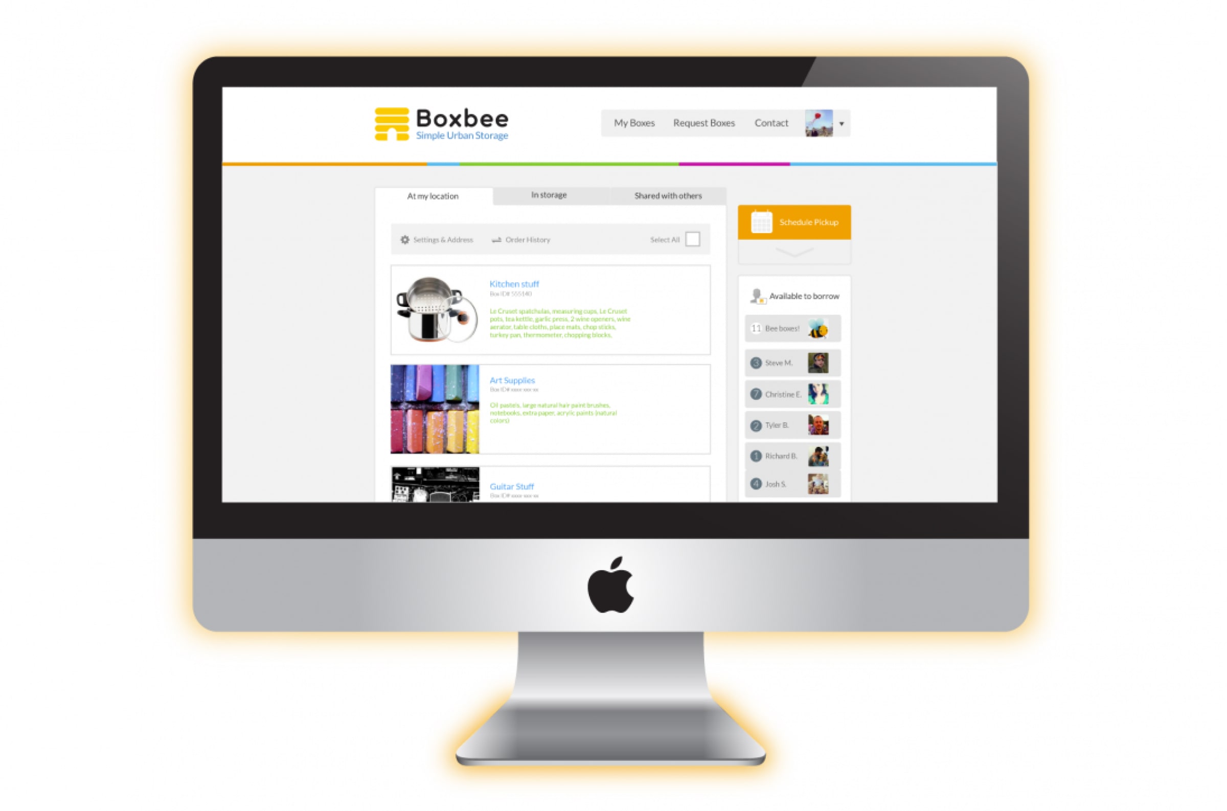
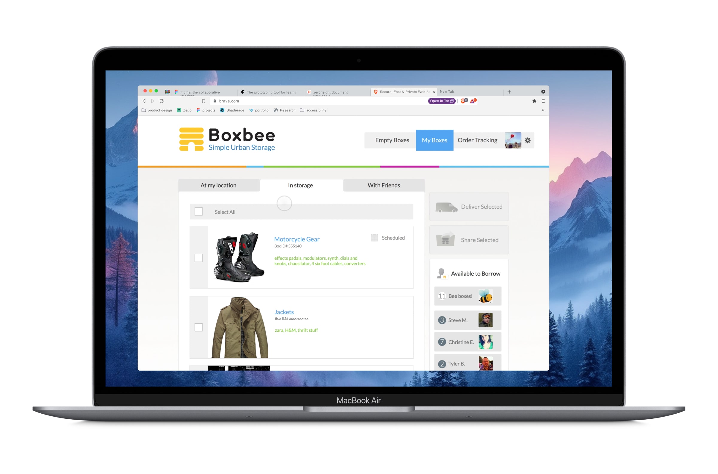
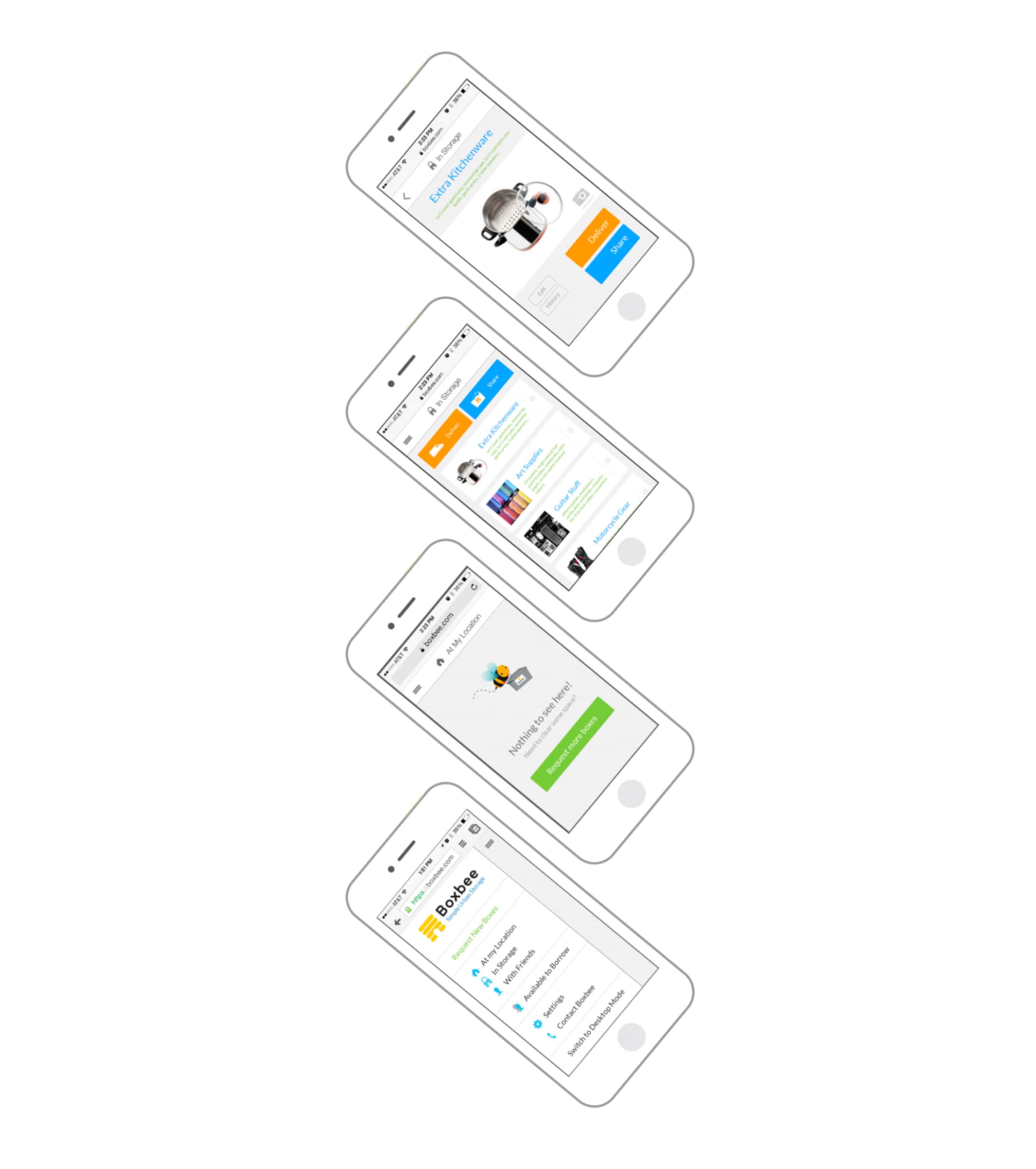
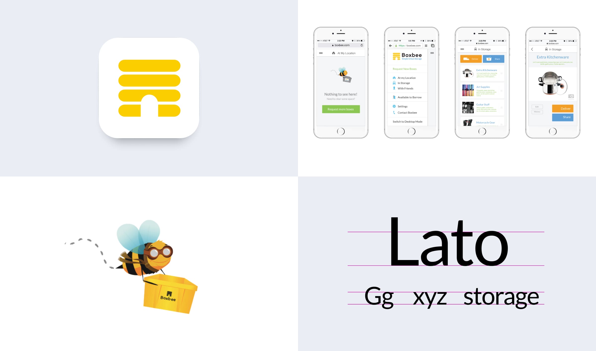
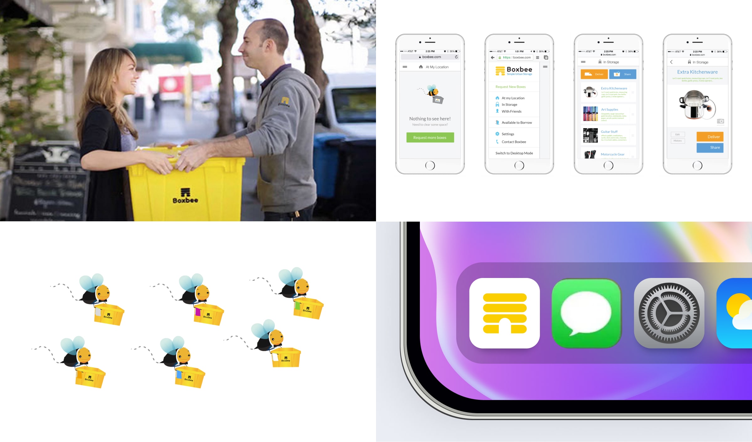
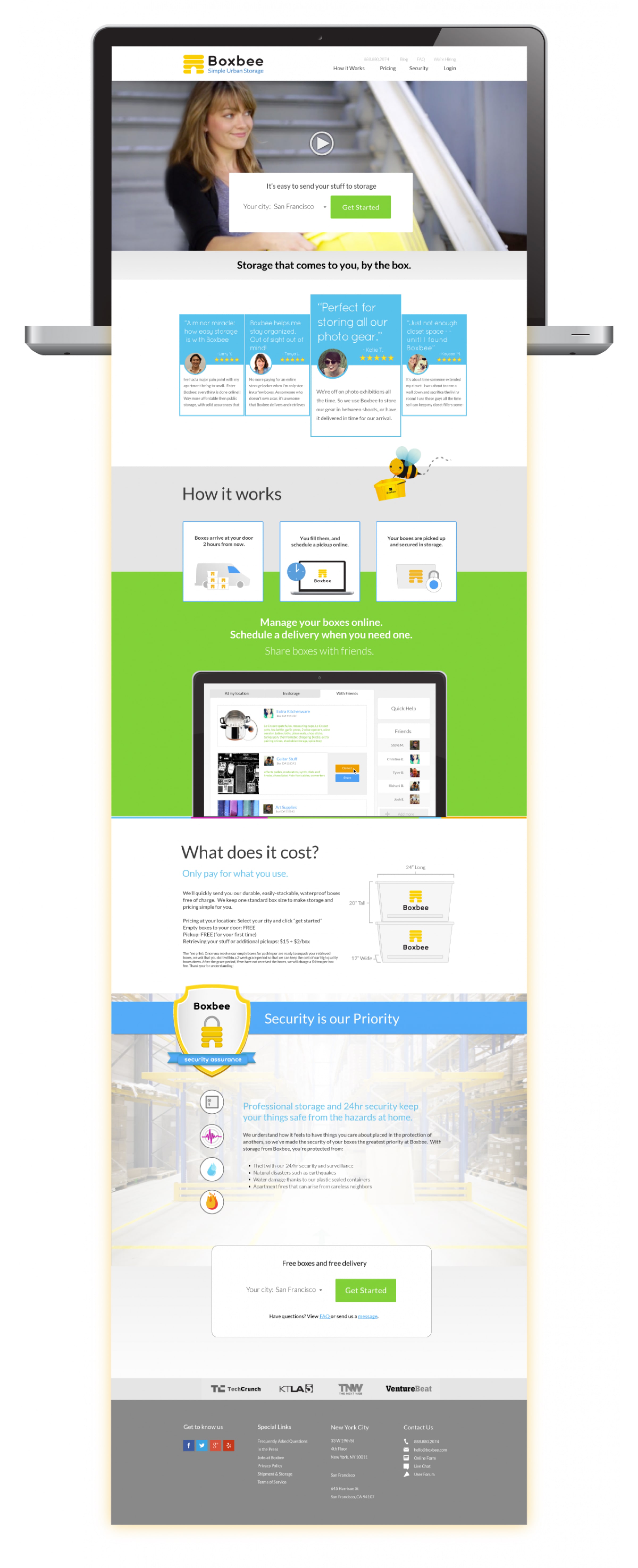
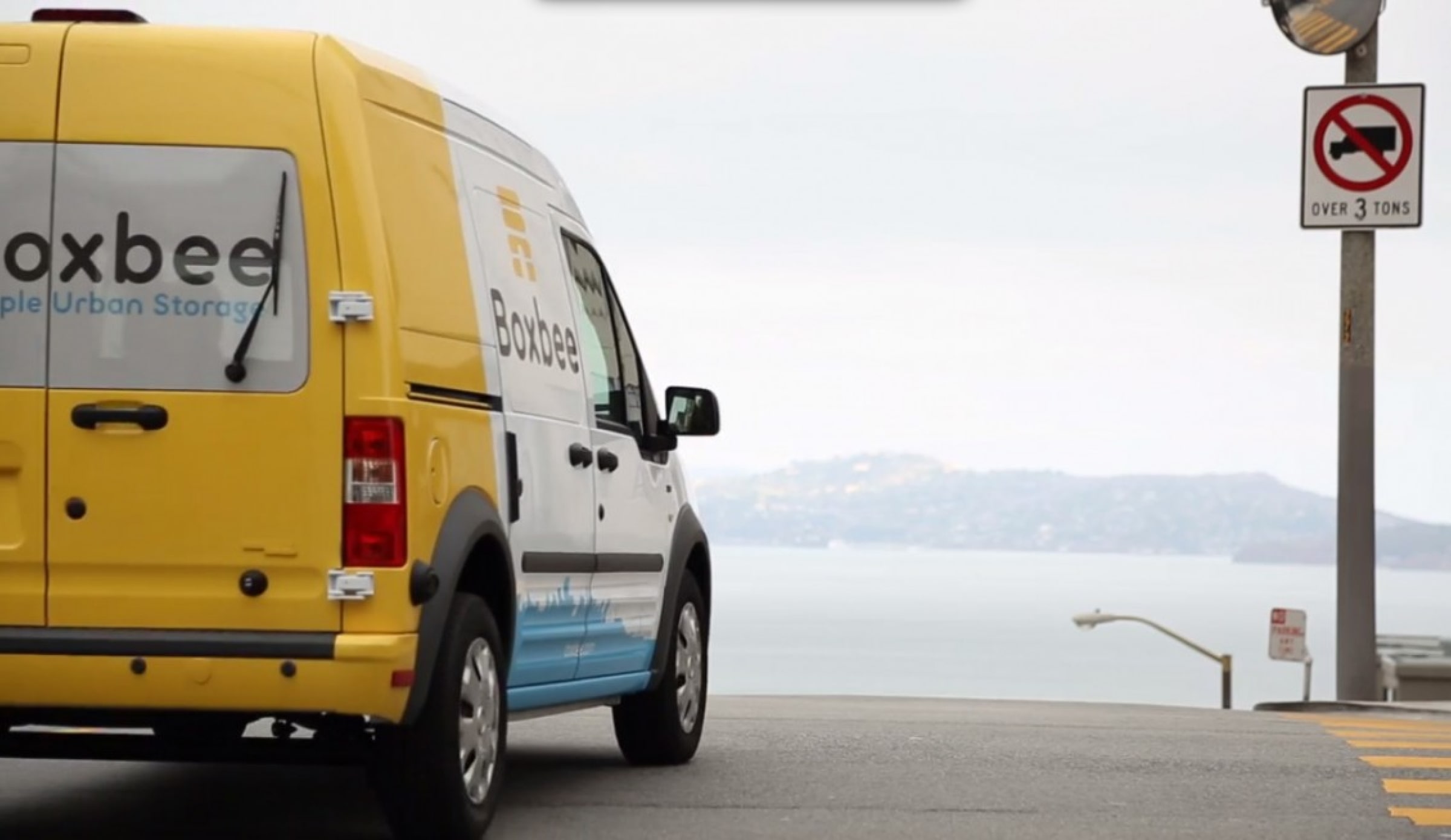
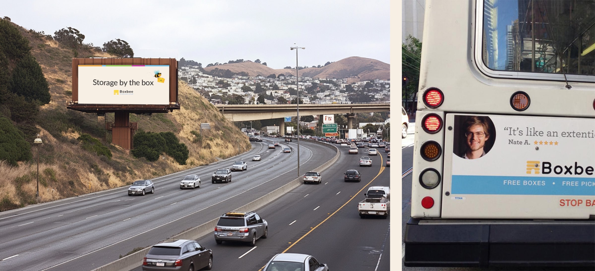
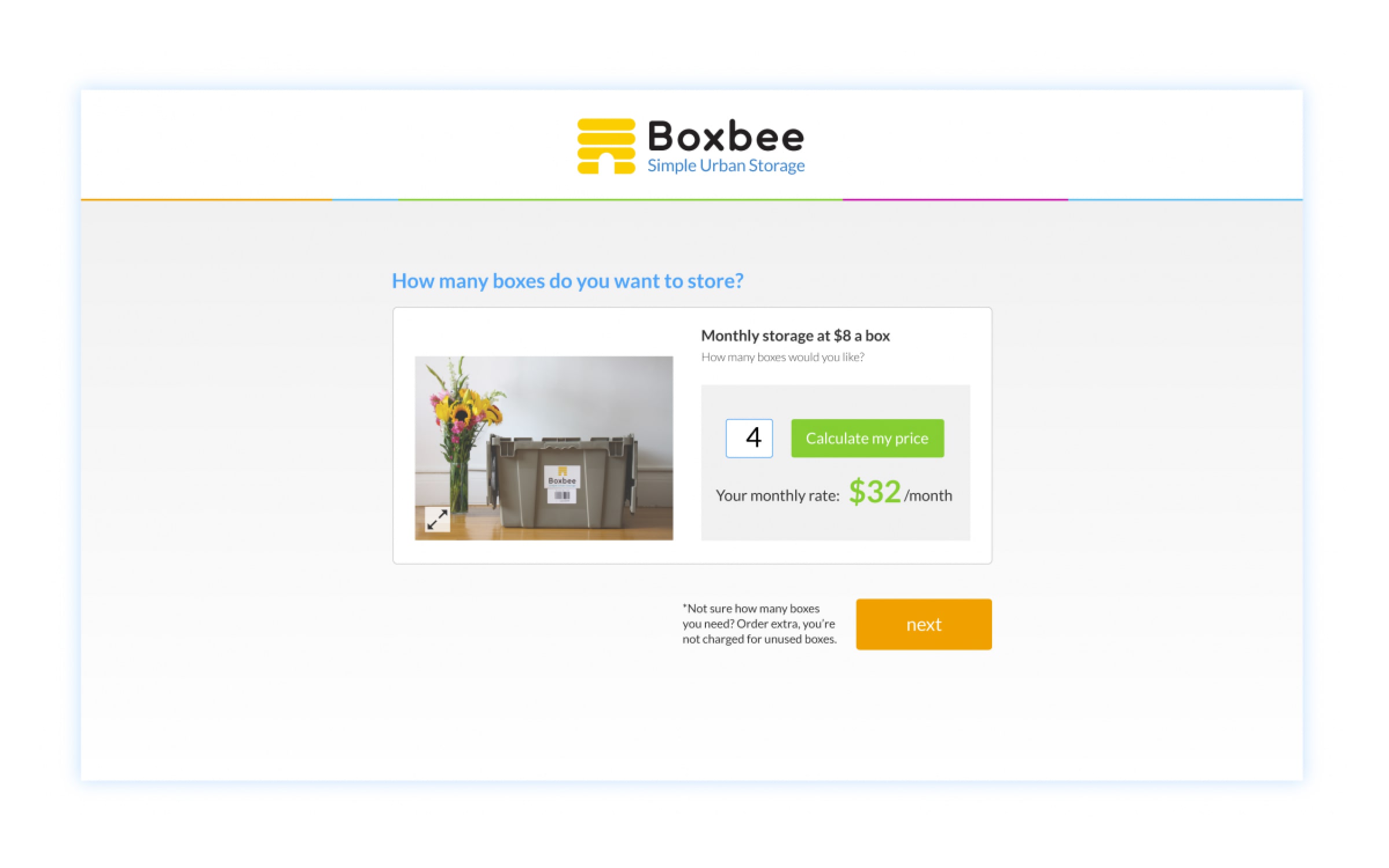
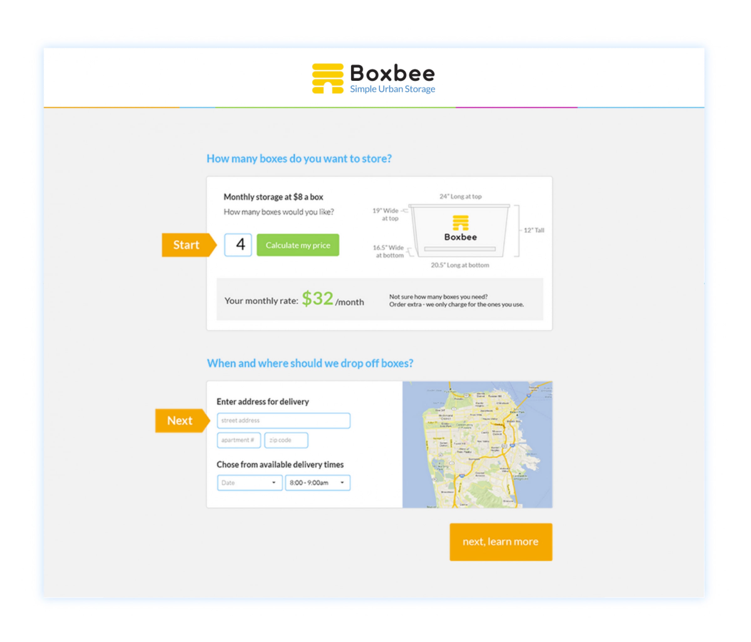
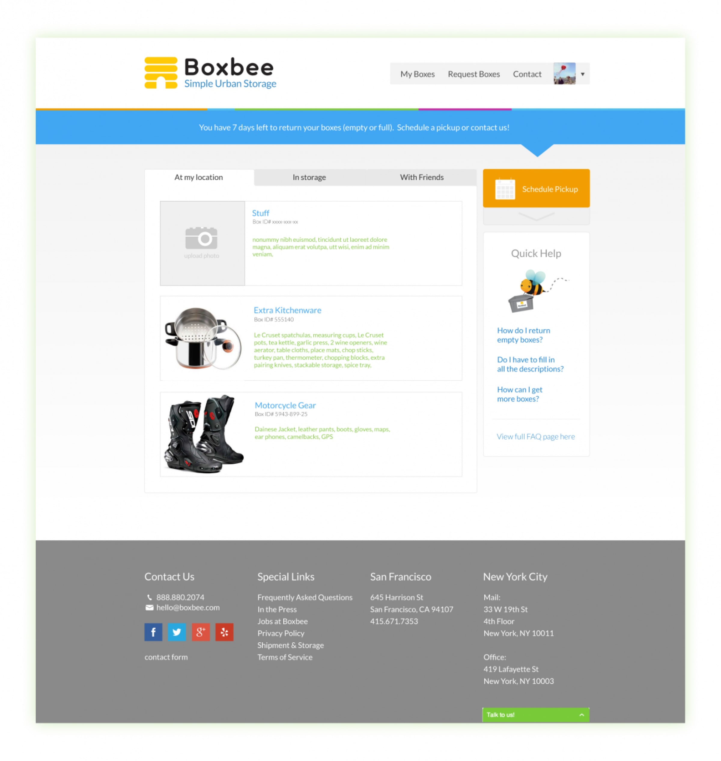
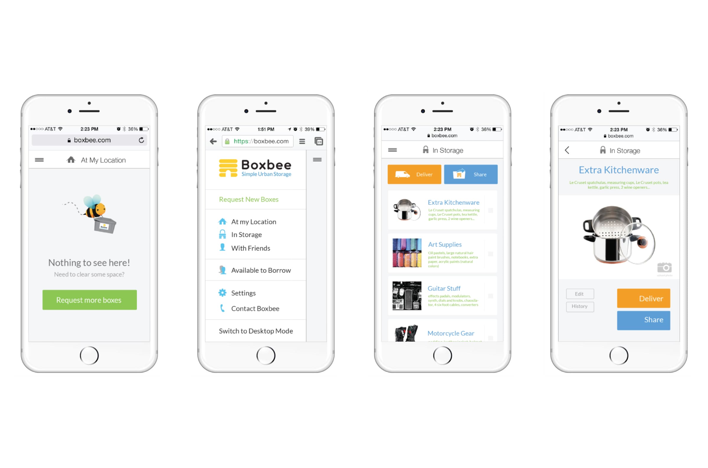
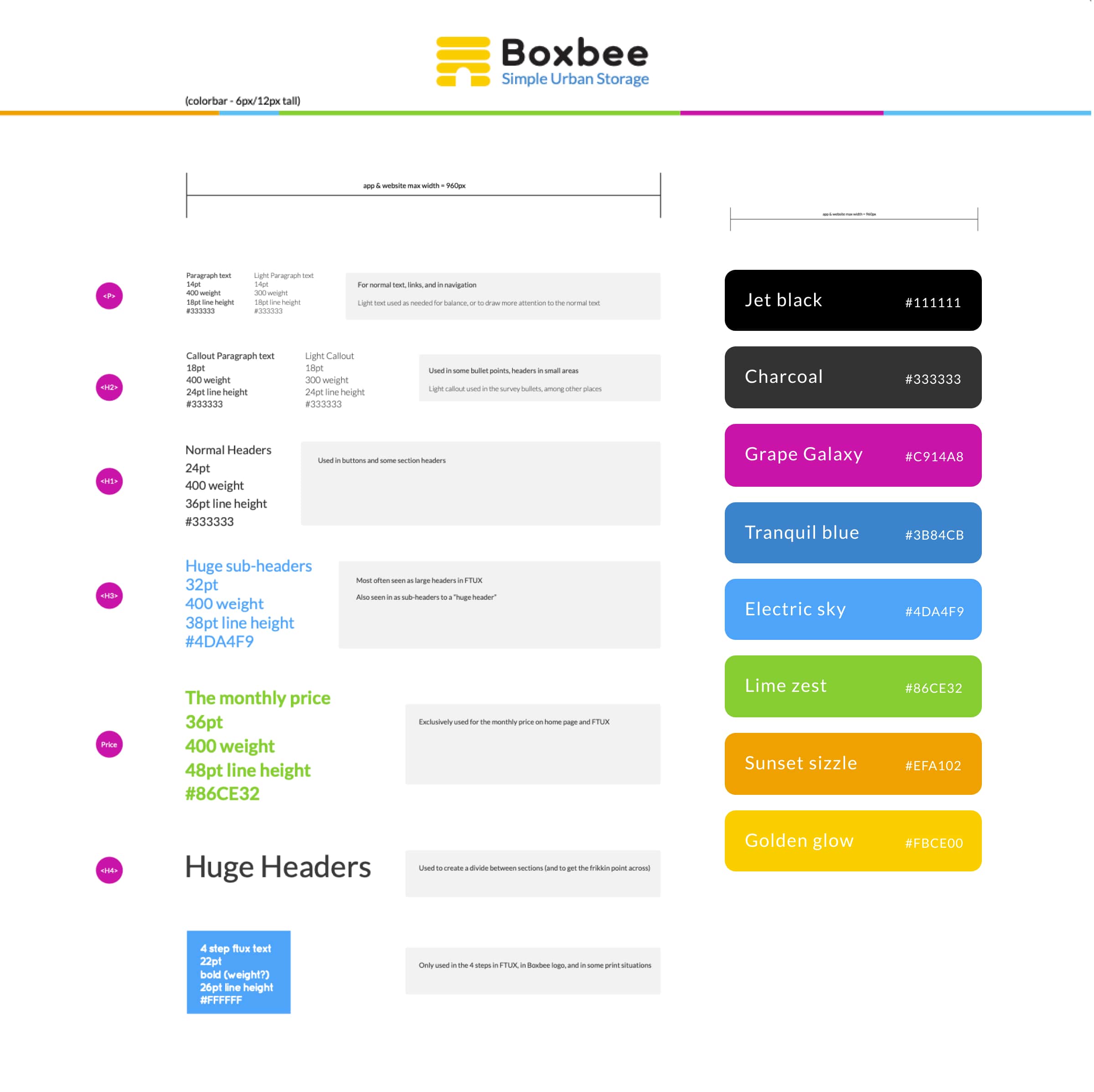
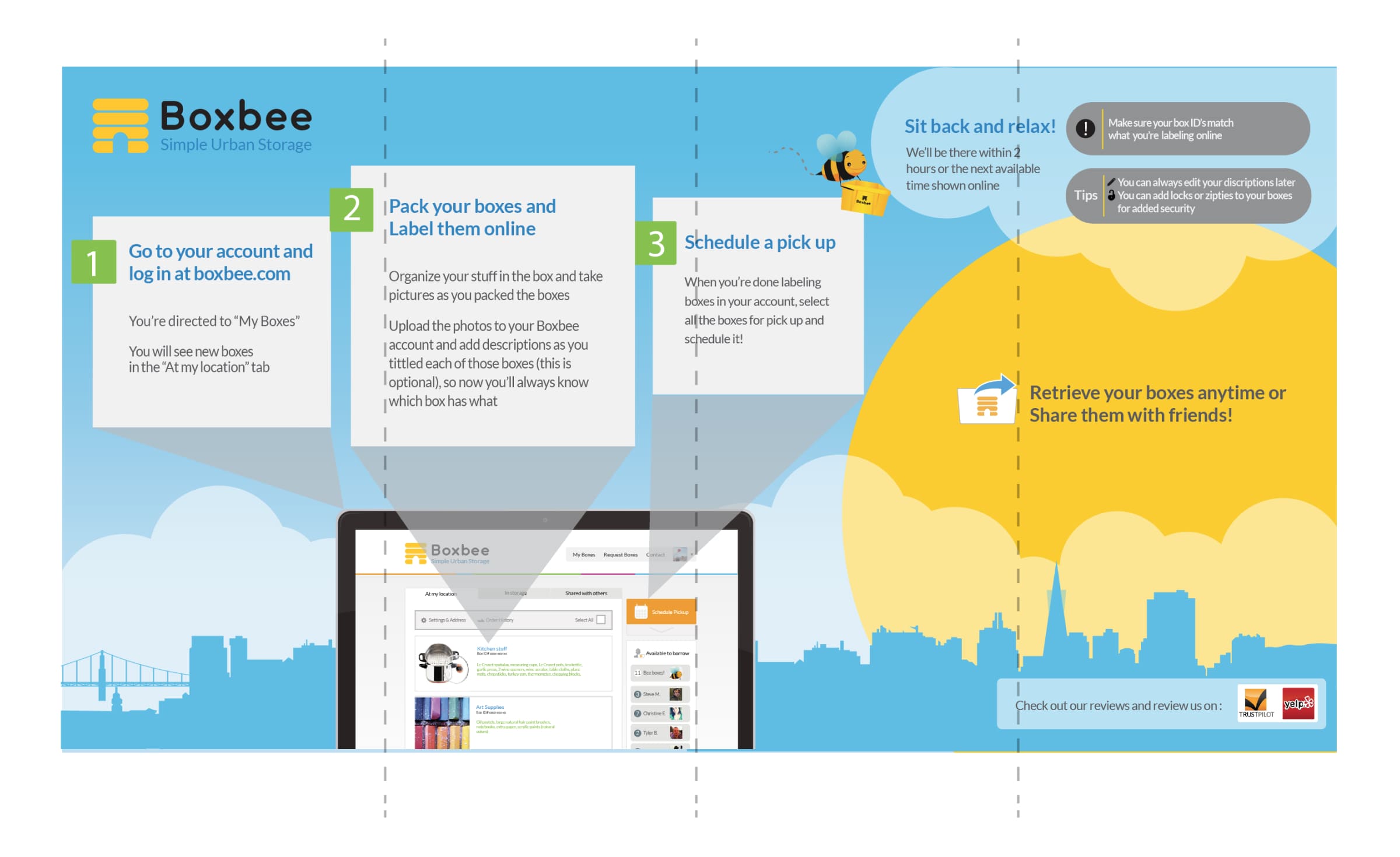
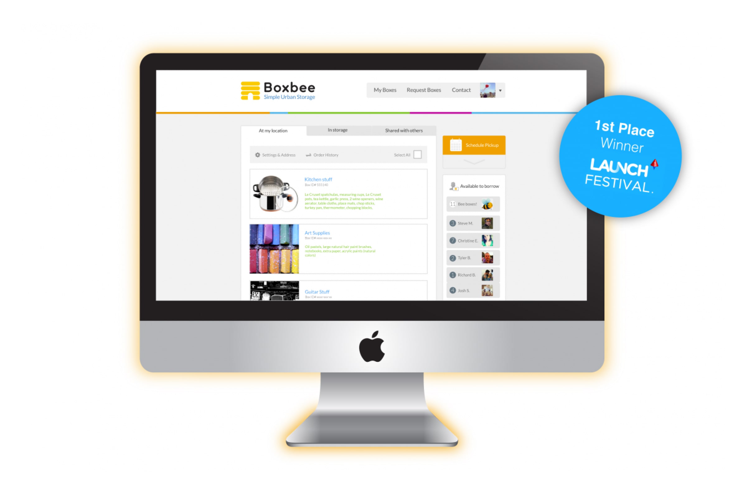
Simple idea: busy urban homes with no closet space get a service that behaves like an extension of the closet. Camping gear or winter coats — an hour away. A few taps in the app; climate-controlled warehouse to door. Product strategy, UX/UI, bright yellow brand, research, photography/video — atomic design systems tagged before Figma dominated.
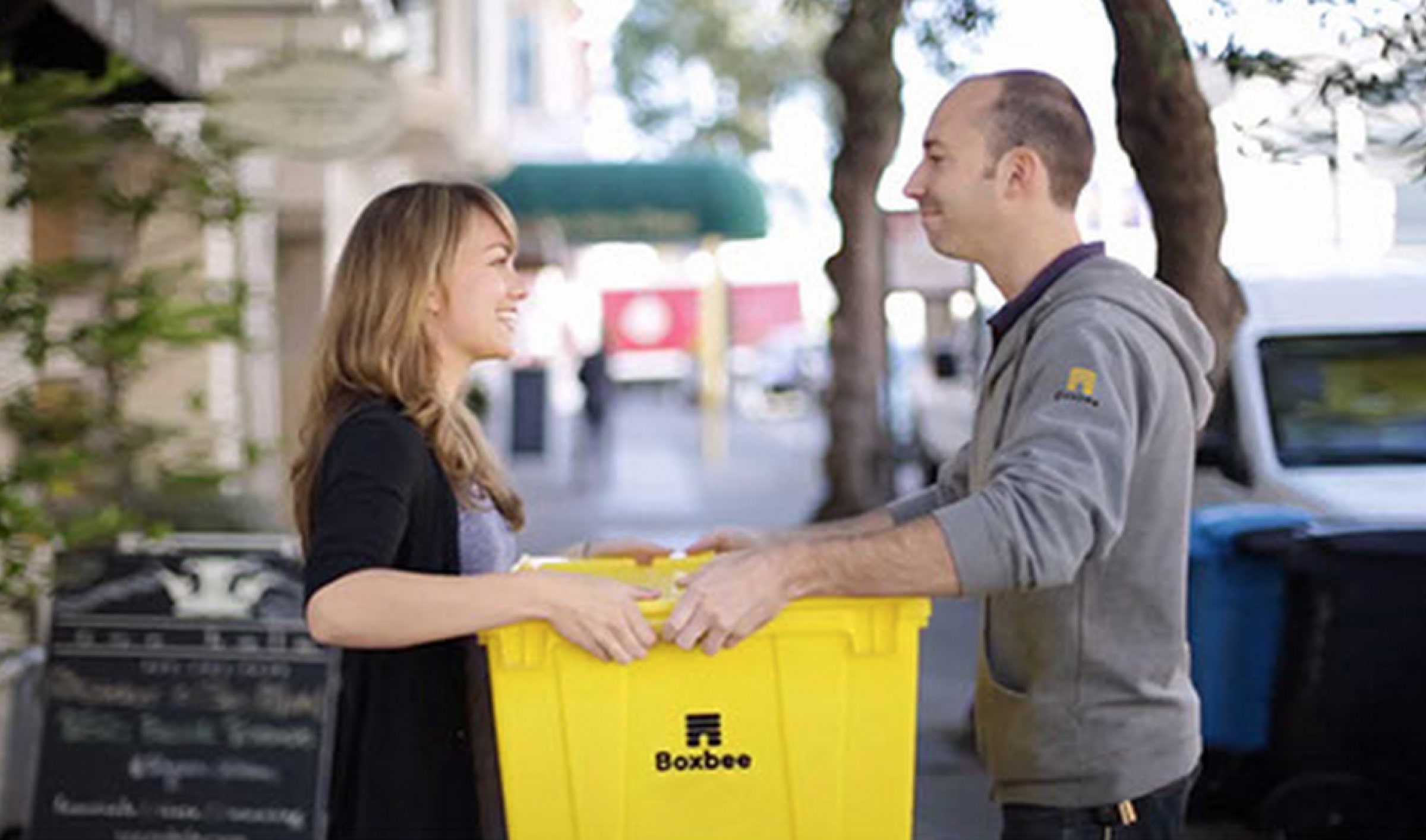
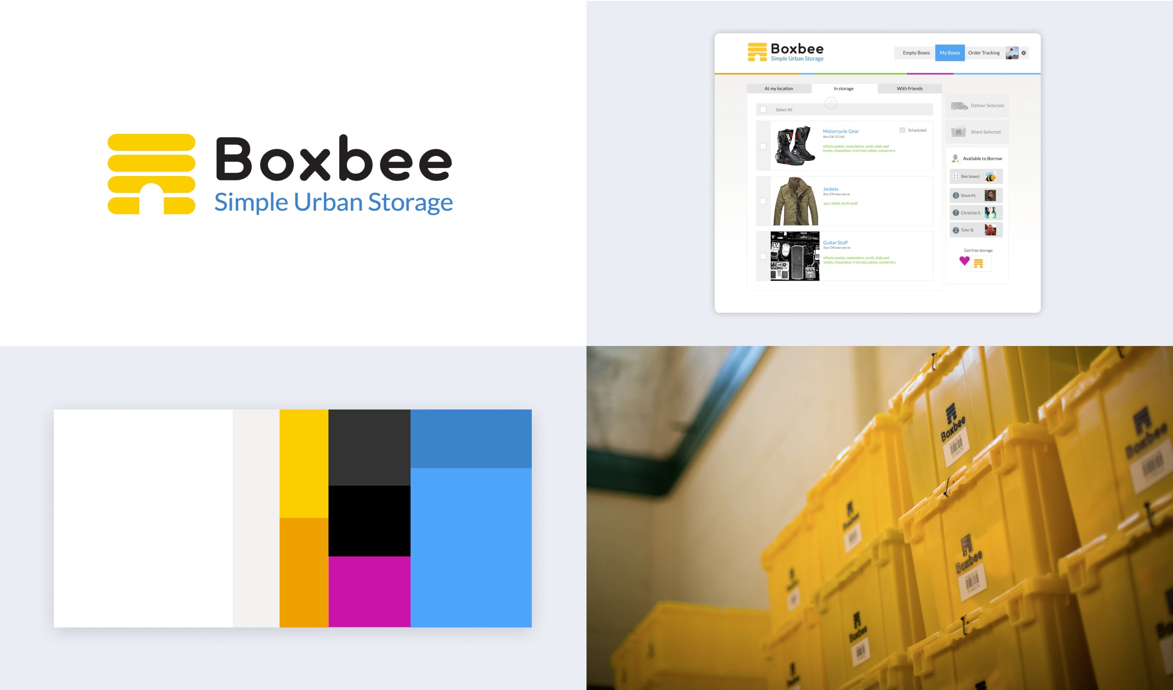
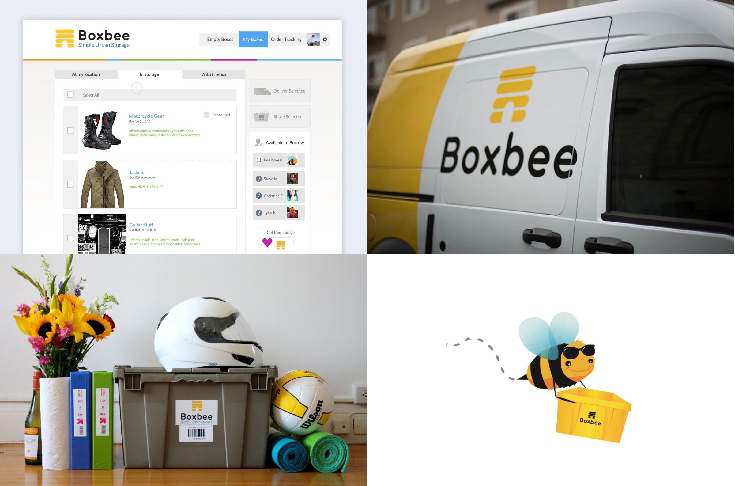
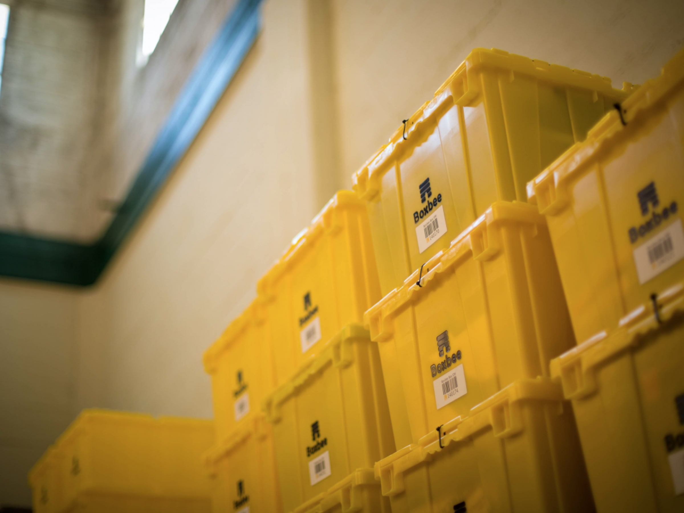
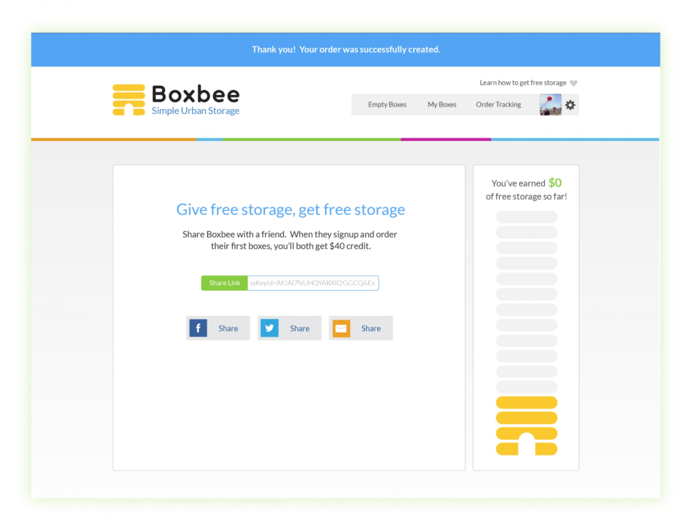
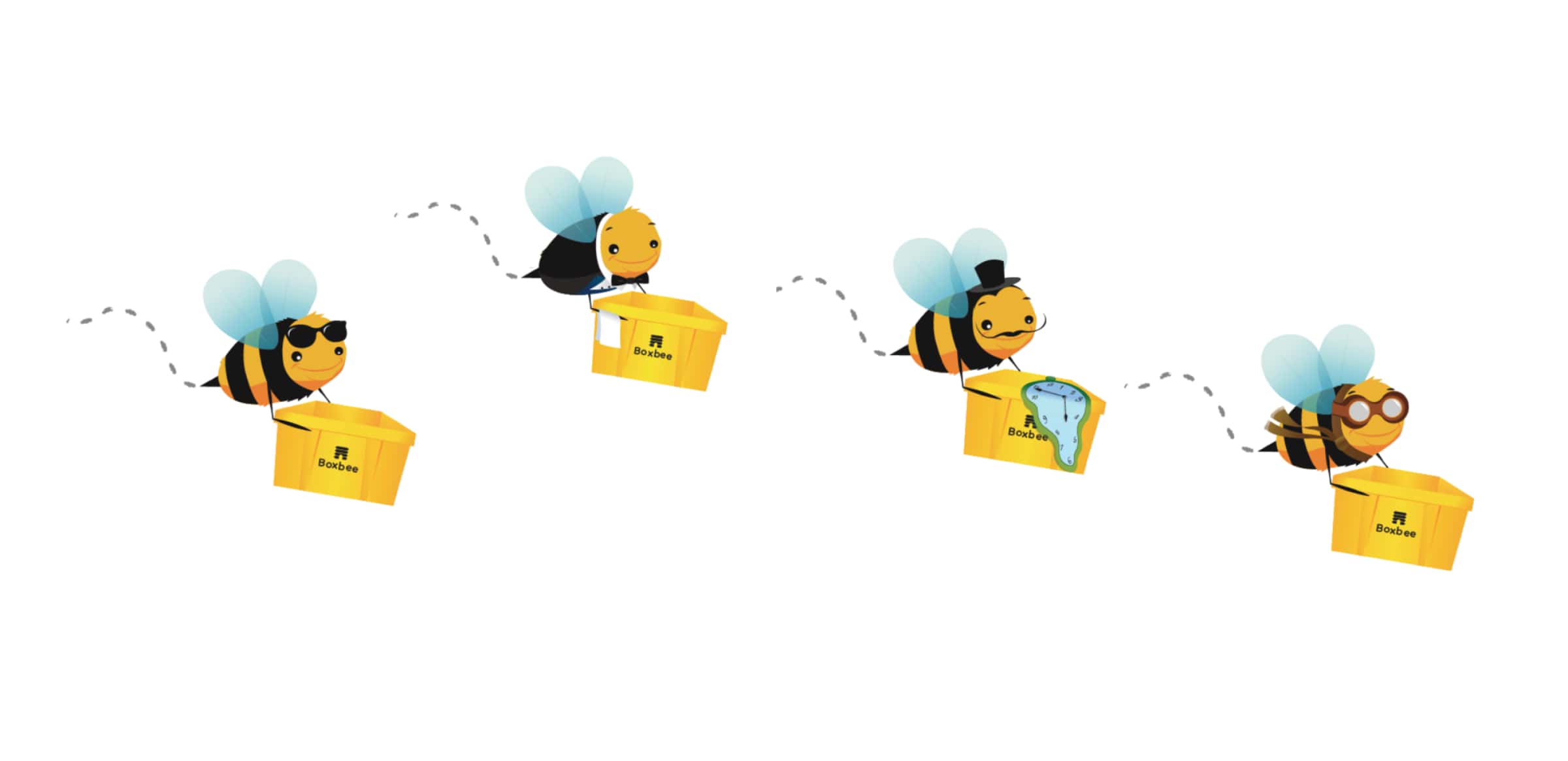
Bright yellow containers made sharing easy — lend a tent with a tap. Product + brand as one system: the yellow box was identity and UX. Logistics products succeed when next action is obvious from inventory state — early agentic UI thinking in consumer clothes.
Today's stack for the service
Today I'd anchor the product on an outcome, not a feature list: customers get their stuff back when they want it, without contacting support. Interview sessions would go into Dovetail, tagged as they come in. The patterns would roll up into an opportunity map (I can't find which box has my ski boots; I want to lend a box to a friend; I forgot the return) that points the next round of design.
The core of the product is a state model. A box can be in storage, in transit, lent to a friend, or overdue, and I'd write that list out in plain text first, with the one next action each state should make obvious. Those outlines would generate first-pass screens. The best ones would become a Cursor prototype in React running on a real state machine, so retrieve, share, and return can be tested with actual transitions instead of static frames. Lifecycle email and push would key off the same states, so the reminder and the screen never disagree. Figma would hold the atomic components the prototype proves out. Outcomes over outputs: success is fewer support contacts, not more screens.
The yellow box stays the hero, as both the brand and the interface. Runway would help cut short clips of boxes out in the city for ads and onboarding. Product and brand are one system: the thing you hold is the thing you tap.
Time Range